A new look for global catastrophic risks
Global Challenges Foundation was founded in 2012 by financial analyst Laszlo Szombatfalvy with the sole purpose to prevent and raise awareness of global catastrophic risks threatening humanity. As a step in their progression, the foundation approached Accomplice to redefine and develop their visual identity.


Global Challenges Foundation work towards a diverse and broad target audience, from research networks, universities and politicians to the general public. One of the biggest challenges was how to create a profile that communicates to both ends of the spectrum whilst still being a clear and consistent brand.

In order to expand our knowledge of the foundation, its values and strategy, we conducted interviews with key profiles connected to the organisation, enabling a more data-driven design approach.
With a more comprehensive understanding of the foundation’s core values and its stakeholders’ needs we started unravelling ways to visualise the foundation’s message.


Since the last graphic profile the media landscape has changed. Placing new demands on compatibility across digital devices.
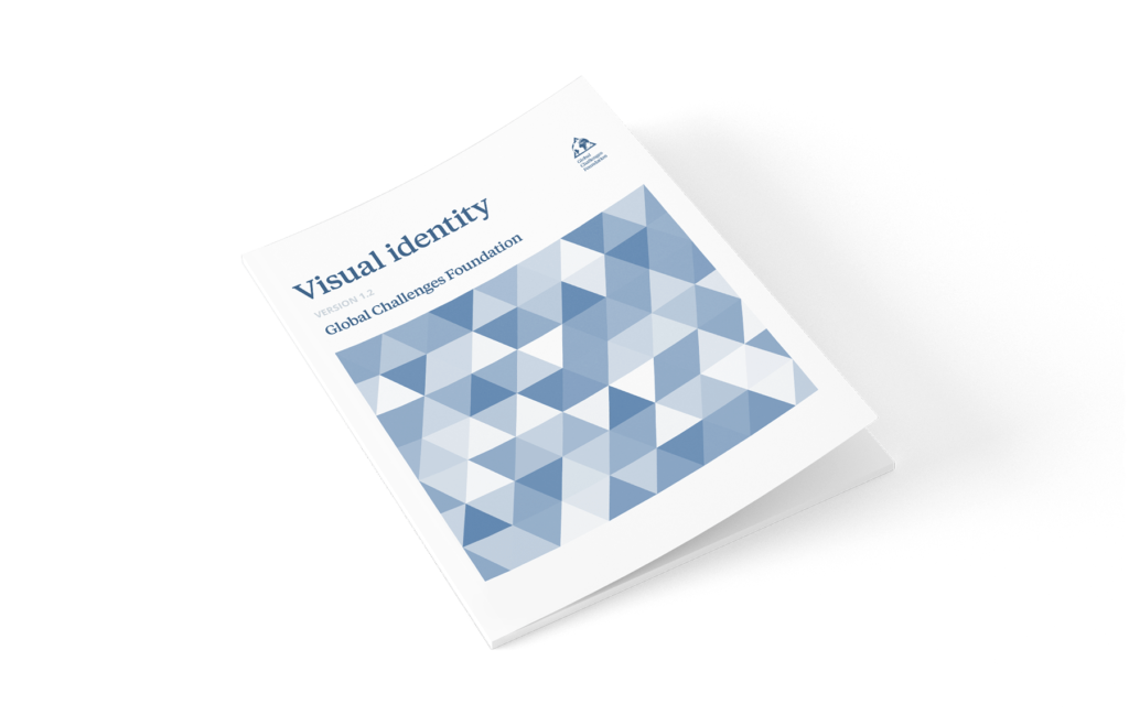
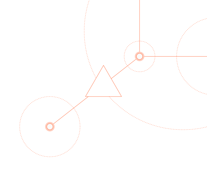
The triangle became a fundamental part of the Foundation’s new visual language. The symbol represents a warning triangle but can and should be used in other ways. The triangle’s geometry is used in graphs, patterns and to some extent in illustrative elements.
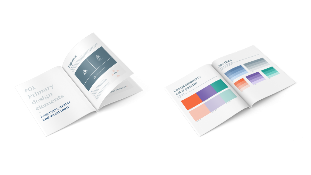
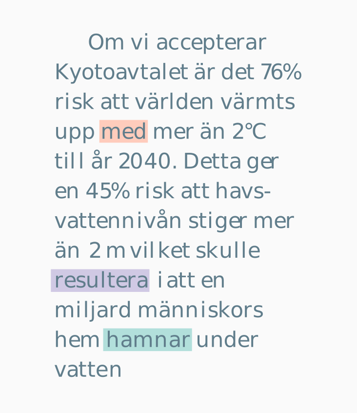
We applied a combination of two fonts to create a synergy between old and new. Heritage and modernity. Tiempos text for headings and Open Sans for body text.

A new set of illustrations and icons were developed to fit the new profile. These utilised low poly 3d graphics, something that fit both with the triangle concept and the foundations foothold in science as polygonal rendering is the most efficient way to mathematically illustrate a 3d object.
